The yield curve compares interest rates on bonds with different maturities.
Most of the time, it’s built using government bonds like U.S. Treasuries.
By lining up short-term yields against long-term yields, the curve shows how markets are pricing interest rates now versus what they expect further out.
Although the yield curve often comes up in economic commentary, it also shows up clearly in real market behavior.
Changes in the curve tend to line up with shifts in currencies, equity indices, and commodity prices.
When the curve steepens, flattens, or inverts, it usually reflects a change in how investors are thinking about growth, inflation, and financial conditions.
The yield curve isn’t a trading signal by itself.
It works more like background context. It helps explain why money starts moving between markets and why certain assets begin to lead while others lose momentum.
The yield curve compares bond yields by maturity and reflects interest rate expectations.
Different curve shapes often appear alongside different market conditions.
Changes in the curve can influence currencies, equity sectors, and commodity prices.
The yield curve works best as context rather than a standalone trigger.
It plots bond yields against the time to maturity.
Traders usually focus on government bonds because they’re liquid, widely followed, and considered low risk from a credit standpoint.
Short-term yields tend to reflect what’s happening right now.
They closely track central bank policy and near-term interest rate expectations.
Long-term yields are more forward-looking.
They reflect how markets expect growth, inflation, and economic stability to unfold over the years ahead.
That difference is what gives the curve its shape.
When confidence improves and growth expectations rise, investors usually want higher returns to lock money away for longer.
Long-term yields rise, and the curve slopes upward.
When caution sets in, investors often move into longer-dated bonds for safety.
That buying pressure can pull long-term yields down, sometimes close to or even below short-term rates.
Traders watch for these shifts because they often signal price action changes elsewhere.
As expectations move, capital tends to move with them.
That flow shows up in currencies, equity markets, and commodities.
Rather than telling you what to trade, the yield curve helps explain why markets are behaving the way they are.
How the Yield Curve Works
Most yield curve charts compare short- and long-term bonds. In the U.S., that usually means Treasury yields.
Short-term yields reflect where interest rates are today, or where markets think they’re heading in the near future.
Long-term yields reflect expectations of the broader picture, including growth, inflation, and economic stability.
The curve moves because expectations move.
If markets start pricing in stronger growth or higher inflation, long-term yields often rise faster than short-term yields.
If uncertainty increases, investors may buy longer-term bonds for protection, which pushes long-term yields lower.
Central bank policy also plays a role.
Changes in policy rates usually affect the front end of the curve first.
Longer-dated yields respond more to sentiment and longer-term expectations.
That gap between policy direction and market belief is what shapes the curve.
There are four curve shapes traders tend to watch:
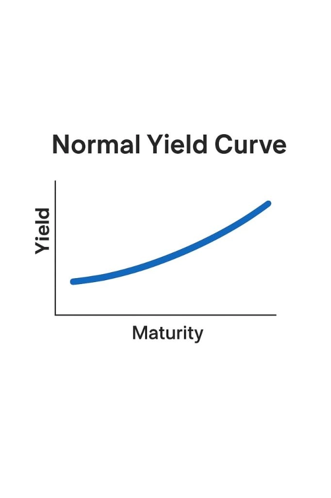
Normal curve: Long-term yields sit above short-term yields. This usually lines up with steady growth expectations.
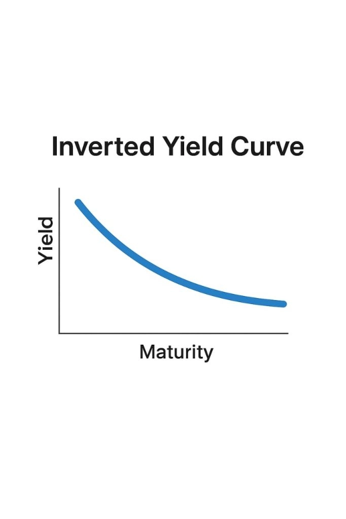
Inverted curve: Short-term yields rise above long-term yields. This often appears when markets expect slower growth ahead.
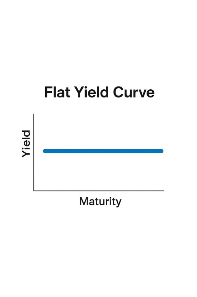
Flat curve: Short-term and long-term yields sit close together. This often reflects uncertainty or a transition phase.
Humped curve: Yields peak in the middle of the curve. This can reflect expectations for near-term tightening followed by slower growth later.
Each shape shows how markets are balancing current conditions against what they expect next.
Yield Curve Shapes and Economic Signals
Different curve shapes tend to line up with different market moods.
Traders watch them because they often reflect shifts in risk appetite.
A normal yield curve usually appears when growth expectations are healthy.
In this environment, markets are generally more willing to take risks.
That often supports growth-linked currencies, equity indices, and industrial commodities.
An inverted yield curve reflects a more cautious outlook. It suggests current rates may be restrictive and that growth could slow in the future.
This environment often lines up with defensive positioning and stronger demand for safe-haven assets.
A flat yield curve tends to show hesitation.
Markets may be waiting for clearer signals from economic data or central bank policy.
During these periods, price action across assets often becomes more selective and range-bound.
A humped yield curve suggests mixed expectations.
Markets may expect tighter conditions in the near term, followed by weaker growth later.
Trends can still form, but they often change faster.
No single shape tells the full story, but together they help frame the broader environment in which markets are trading.
Yield Curve and Forex Trading
Forex markets are tightly linked to interest rate expectations.
The yield curve helps traders see how those expectations are changing over time, not just where rates are today.
Currencies often respond to yield differentials.
When yields in one country rise relative to another, that currency can become more attractive.
For example, when U.S. yields move higher relative to Japanese yields, the dollar often strengthens against the yen.
When that gap narrows, the move can reverse.
This sits behind carry trades. In a carry trade, traders borrow a low-yielding currency and buy a higher-yielding one. USD/JPY is a common example.
When the U.S. yield curve steepens, carry trades often look more appealing.
When the curve flattens or inverts, those trades tend to unwind, which can strengthen safe-haven currencies like the JPY.
The yield curve also helps explain risk-off flows. During periods of stress, long-term yields often fall as investors look for safety.
That flattening or inversion frequently lines up with stronger demand for defensive currencies, including the Japanese yen and Swiss franc.
Rapid changes in the curve can also affect volatility.
When rate expectations shift quickly, major currency pairs often move more sharply.
When the curve is stable, trading conditions tend to be calmer.
For forex traders, the yield curve provides context.
It helps explain whether a move is driven by growth expectations, policy outlooks, or changing sentiment.
Yield Curve and Equity Indices
Equity markets tend to respond to the yield curve through leadership changes rather than sudden shifts in direction.
When the curve slopes upward, markets are usually pricing in economic expansion. In that environment, cyclical sectors often attract more interest.
These include industrials, financials, consumer discretionary, and technology.
Higher long-term yields suggest stronger growth expectations, which supports earnings outlooks and broader indices.
As the curve begins to flatten, investor behavior often changes.
Growth expectations become less certain, and markets begin to favor stability.
Defensive sectors like utilities, healthcare, and consumer staples often hold up better during these phases.
An inverted yield curve is one of the most closely watched signals for equity markets.
It reflects expectations that current rates are restrictive and that growth may slow.
Historically, inversions have often appeared ahead of weaker equity performance.
They don’t predict exact timing, but they tend to coincide with rising caution and tighter financial conditions.
Interest rate expectations also feed directly into valuations.
When long-term yields rise, future earnings are discounted more heavily, which can pressure index levels.
When yields fall, valuations may look more attractive, especially for growth stocks.
For equity traders, the yield curve helps explain why certain sectors lead or lag and why broader indices behave differently at different points in the cycle.
Yield Curve and Commodities
Commodity prices are closely tied to expectations around growth, inflation, and interest rates.
The yield curve helps explain those expectations and why different commodities respond differently.
Two groups stand out.
Gold, which reacts strongly to real interest rates, and energy commodities, which are more sensitive to growth and demand.
Gold and Real Rates
Gold doesn’t pay interest.
Because of that, it tends to move in the opposite direction to real yields, which are interest rates after inflation.
When the yield curve flattens or inverts, markets often expect slower growth or future rate cuts.
Long-term yields may fall while inflation expectations remain steady.
That pushes real yields lower, which often makes gold more attractive.
When the curve steepens due to rising real yields, gold can come under pressure as investors favor interest-bearing assets.
The yield curve helps explain whether gold is reacting to falling real rates, rising inflation expectations, or both.
Energy and Growth Expectations
Energy commodities respond more directly to economic activity.
Demand for oil and natural gas tends to rise when growth expectations improve and fall when markets expect a slowdown.
A steepening yield curve often reflects stronger growth expectations.
In that environment, energy demand forecasts usually improve.
A flattening or inverted curve often signals weaker demand ahead, which can pressure prices.
Inflation expectations sit in the middle.
A steeply rising curve driven by inflation can broadly support commodities.
A flattening curve driven by slowing growth may support gold but weigh on energy.
Using the Yield Curve as a Practical Framework
The yield curve works best as context, not a trigger.
A practical approach is to track key spreads, such as the gap between short-term and long-term yields.
Many traders watch the 10-year minus 2-year spread to see whether expectations are shifting.
When the curve steepens, traders often look for confirmation in other markets.
Risk-sensitive currencies may strengthen, equity indices may rotate toward cyclical sectors, and growth-linked commodities can gain support.
When the curve flattens or inverts, markets often turn more defensive.
Safe-haven currencies may strengthen, equities can lose momentum, and gold may attract interest.
Rather than acting immediately, many traders wait for alignment across markets.
The yield curve helps explain why those moves are happening.
Trading Across Markets Using Yield Curve Signals
Yield curve changes rarely affect just one market.
A steepening curve often lines up with improving growth expectations.
That can show up in stronger risk-linked currencies, firmer equity indices, and higher industrial commodity prices.
A flattening or inverted curve usually reflects more caution.
Safe-haven assets often attract demand, and equity momentum can fade.
Because these moves are connected, it helps to view markets together rather than in isolation.
Instruments like CFDs allow traders to take long or short positions, adjust exposure, and trade multiple asset classes without owning the underlying assets.
Platforms like PU Prime, which offer forex, indices, and commodities in one place, make it easier to observe how a single macro theme plays out across markets.
Next Steps
Once you’re familiar with how the yield curve moves, it becomes a useful way to add context to market behavior.
It helps explain changes in currencies, equities, and commodities that might otherwise seem unrelated.
The yield curve works best alongside price action and other signals.
Watching how it steepens, flattens, or inverts over time can help you stay aligned with broader expectations rather than reacting to individual headlines.
Try PU Prime Today
If you want to see how these relationships play out in live markets, platforms like PU Prime provide access to multiple asset classes through CFDs.
Sign up for a demo account to try it for yourself, and apply yield curve insights before trading with real capital.
FAQs
How quickly do markets react to changes in the yield curve?
Markets don’t usually react to the yield curve all at once.
In many cases, bond markets move first, then currencies, followed by equities and commodities.
Sometimes the adjustment happens over weeks or months rather than days.
That’s why traders often treat the yield curve as a slow-moving backdrop rather than a short-term signal.
It helps explain why trends are forming, even if prices don’t respond immediately.
Can the yield curve send false signals?
Yes. The yield curve reflects expectations, not guarantees.
There have been periods where the curve flattened or briefly inverted without triggering a recession or significant market downturn.
Central bank intervention, heavy bond buying, or unusual policy conditions can also distort the curve. That’s why many traders use it as confirmation rather than relying on it alone.
Which part of the yield curve do traders watch most closely?
While the full curve is important, traders often focus on specific spreads.
The 10-year minus 2-year Treasury spread is one of the most widely followed because it captures the gap between near-term policy expectations and longer-term growth expectations.
Some traders also watch shorter spreads, such as the 5-year minus 2-year, to gauge changes closer to the policy cycle.
How does the yield curve differ from interest rate announcements?
Interest rate decisions show where policy stands today.
The yield curve shows where markets expect rates and growth to move over time.
Central banks control short-term rates, but they don’t fully control long-term yields.
That’s why the yield curve can sometimes move in a different direction from policy announcements and still influence markets.
Does the yield curve matter outside the United States?
Yes, but the U.S. yield curve tends to have the most significant global influence because U.S. Treasuries are widely used as benchmarks.
Yield curves in other regions can still matter, especially for local currencies and equity markets.
For example, changes in European or Japanese yield curves can influence EUR/JPY pairs.
Many traders still use the U.S. curve as a reference point because of its global reach.
How does inflation change the way the yield curve should be read?
Inflation affects both nominal yields and real yields.
A steepening curve driven by inflation expectations can have very different market effects than a steepening curve driven by stronger growth.
In inflation-driven moves, commodities and inflation-sensitive assets may respond more strongly, while equities may struggle if higher rates start to pressure valuations.
This is why traders often look at inflation data alongside the yield curve.
Can short-term traders use the yield curve, or is it only for long-term analysis?
Short-term traders can still use the yield curve, but usually as background context.
It won’t tell you when to enter or exit a trade.
Instead, it helps explain whether market conditions favor risk-taking or caution.
That context can influence how aggressive or conservative a trader chooses to be with position sizing or trade selection.
Commencer à trader avec un avantage
Tradez le Forex, les indices, Métaux et plus encore avec des spreads faibles et une exécution ultra-rapide.
Commencez à trader avec des dépôts aussi faibles que 50 $ sur nos comptes standard.
Accès 24h/24 et 7j/7 à notre service d’assistance.
Accédez à des centaines d’instruments, à des outils pédagogiques gratuits et à certaines des meilleures promotions du moment.